
CSI/
Velocity SOlutions

I started at Velocity Solutions in Summer of 2022, which was acquired by CSI in fall of 2024. As the sole UX/UI Designer, I was responsible for overseeing all of our UX/UI across all our entire product suite. I created and maintained our UI style guide, built wireframes and prototypes, studied UX trends and guidelines, maintained ADA/WCAG compliance, and completely overhauled multiple products to give them a facelift to match our updated UI style. Managing a cohesive suite of products across multiple development teams was a challenge, but I was able to learn and build on my prior knowledge so much in this role. Check out some of my work below!


01 COMPONENT LIbrary &
UI Style Guide
VARIANTS
RESPONSIVE
FIGMA
ZEPLIN
300+ COMPONENTS
When I started at Velocity Solutions, they had a semi-functional component library built out in Sketch. A lot of the components were linked incorrectly, unresponsive, or just plain didn't work. After getting my footing, I petitioned to transition to Figma rather than Sketch, and began building a new components library from scratch -- and then entirely new working mockups.
Every element of each screen links back to a component, a color in library, or a text style in the library. Each element is then linked to the component library in Zeplin, which the development team is able to easily pull code from, or just reference to see what an element should look like.
There are over 300 different components that can be used across all of our products, including different variants for different circumstances or specific products.
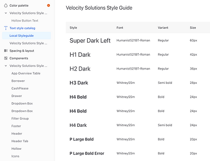
Component library in Zeplin with the text styles displayed.
SAMPLES OF COMPONENTS

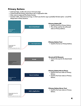
Secondary Button style & all possible Variants, including hover & disabled states.
Status Badge Icons - used for Akouba.


Handful of Field Variants, used across all products, including ADA friendly Tool Tip Variant.
Handful of icons, used across all products.


Three different product footer variants, as different products needed different information displayed.

UI Style Guide
Paired with the component library, I created a digital booklet that includes all of the rules and styles that gowith each component. This includes buttons, hover/focus states, field labels, status colors, fonts, and so much more. This guide is easily referenced for 'standards' that we want to maintain across the sites, and can answer questions that our development team has quickly and certainly. Code can also be pulled from the style guide to make the development teams work even more efficient.


COHESIVE PRODUCT SUITE
Akouba - Lender
VIP


Rewards
CashPlease


02 Product Facelift


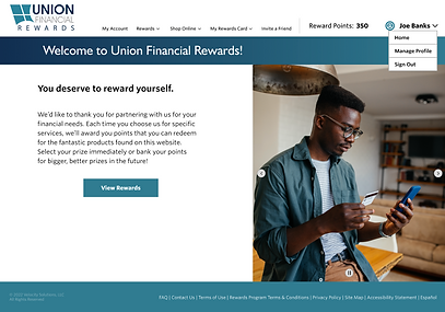
The current Rewards platform landing screen.
The facelift design for the Rewards platform landing screen.
When I resumed responsibility of Velocity Solution's UX/UI, I still had to bring the Rewards, CashPlease, Akouba Micro, and some of the ILS product up to our new design standards/style. This project was lovingly called the 'Facelift', and I was tasked with redesigning the site with our new product UI Style guide without changing any(or much) of the current functionality. This project allowed us to bring our sites out of the early 2000s and into the modern era of design, all while gently tweaking and perfecting their accessibility and alignment with the WCAG AA standards.
Our Akouba products (Lender & Borrower) and our Rewards platform are our the two biggest sites and took the most time and effort to facelift. When I began at VS, Akouba had already been mocked up and developed, so my main goal was keeping them up to date and making sure our development team was implementing the designs correctly. The Rewards platform, however, I saw through from the very beginning with a blank Figma canvas.
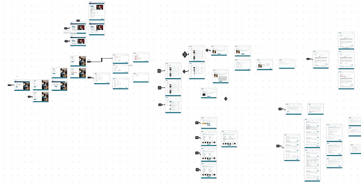
The Rewards facelift went through a hefty bit of iterations as I worked with various stakeholders, including product owners, developers, and company C-Suite members, to make sure that nothing went overlooked. Being the sole designer, I really valued having a team that was able to review and critique the work I was doing. I referenced the current build to create a user flow map, and then I built each screen, section by section, meeting by meeting, until we had a fully fleshed out platform once again. I rebuilt the user flow with the mockups I'd made to pass along to the relevant stakeholders, and now have been working with our developers to make sure everything is implemented smoothly, with our UI Style Guide & our users in mind.

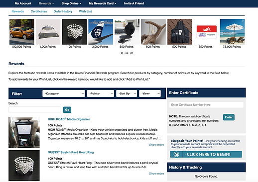
The current Rewards platform rewards page.

The facelift design for the Rewards platform rewards page, which minimizes clutters/redundant links, helping customers from feeling 'User Fatigue' while trying to navigate the page.

A chunk of the user flow map for the Rewards platform, created to help the development team build the site in the correct order without any missing functionality.
03 ADA/WCAG Compliance
Almost all of Velocity Solutions products promise ADA WCAG AA compliance, and all public facing products do. I have worked with our developers and QA specialists to write up bugs and user stories to make sure that all of the WCAG A & AA guidelines are accounted for. Because our products are offered as 'White-labeling' products, meaning customers can flow their colors into our designs, I had to be extra thorough with all of our designs to make sure one customer wasn't left behind just because they chose a color scheme that was hard for some users to see. I worked with our BSA to create a formula that could be used to assign contrast appropriate colors as button text, text over color blocks, etc. so that no site would be the exception to our promised WCAG AA compliance.
I studied the WCAG guidelines and used tools just as color contrast checkers to ensure that my baseline mockups were compliant, and then worked with our team to tweak for specific user cases along the way.


An example of a bug found in our Borrower platform, which promises WCAG AA compliance. This bug shows the sidebar menu failing a test for 3.2.3 Consistent Navigation, which was promptly fixed.
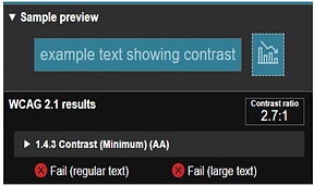
An example of a contrast tool being used to ensure compliance with WCAG 1.4.2 Contrast. This instance passed the contrast ratio with a 4.6:1 after some tweaks to the design, but originally was failing at a contrast ratio of 2.7:1.